Commission
I've been so deeply devoted to my process-oriented, non-objective painting that it was difficult to switch gears to take on a very straightforward, heavily art-directed, figurative commission. There was very little freedom here for play, or spontaneity. But...it helps pay the bills, and it's either this or bar-tending.
The commission was for a new cardiology wing in a medical center, so the client requested paintings of middle-aged and multi-generational people, of diverse ethnicity, with dogs, in a park-like setting, enjoying light activities. Colors were to match the decor - carpets, fabrics, etc. No drippy red paint...this is a hospital! In fact, only use red as an accent. No backs to the viewer - all figures should be facing the viewer, or at least a three-quarter view. (this was a new one for me) The overall feeling should be uplifting, optimistic. Limit the texture, limit the abstraction. (Limit the pleasure!) I soon found myself researching daiquiri recipes.
Not really. Actually, I just reverted to my inner illustrator, and the years I worked for publishers, ad-agencies, etc., and committed to making this client happy. So, we started with rough sketches. This is basically me asking the question, "is this what you had in mind?"

Once we established the general compositions for each piece, I set about to make them come to life. I know what a middle-aged body looks like. Unfortunately. I will admit to having some fun with this part though...

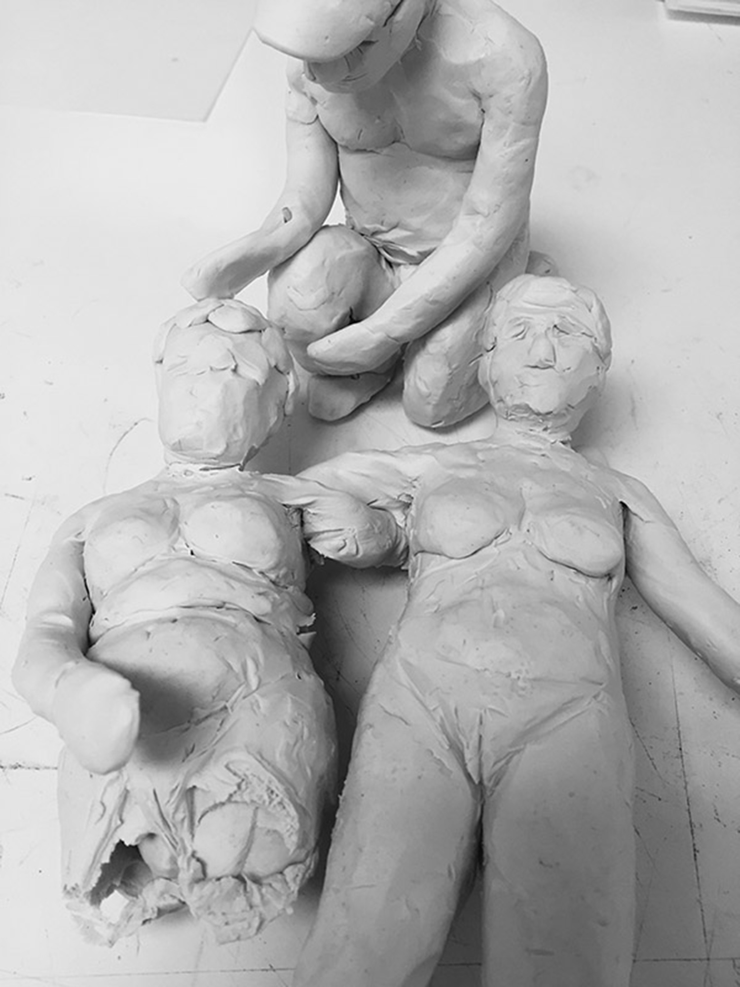

I was able to arrange my figures exactly how I liked, light them, and choose from a variety of angles to view and sketch again. Color sketches, rendered a little more precisely, allow the client to confirm that I heard what they said.

Apparently I didn't, as the sketches came back with a list of corrections. This normal, and if you're an illustrator, you don't take this stuff personally. It's just feedback...so you can give your client exactly what they're paying you good money to do. Tone down those colors (especially reds), reduce the areas with patterns, add another dog, use more yellows and greens (client prefers spring to autumn), lighter, brighter, fresher palette.

With final images of the finished work approved, the paintings are shipped to the customer. Yay! They are happy, and I have money in the bank to pay the rent so that I can do what I truly love....spatter drippy red paint over highly textured, completely unplanned, complex compositions of ambiguous shapes and marks that I dreamed up as I went along.
